The Covid-19 pandemic is affecting our lives in every possible way. This is a first in many respects, one of which being that this is the first epidemic for which data regarding cases, deaths and recoveries are being made available in almost real time.
A number of data scientists have been trying to make sense of the available data from many possible angles. Nevertheless, little more than the obvious (and expected) exponential increases have come out of most of the analyses. We now know that the virus is highly contagious and that exponential growth of cases should be the norm, but the goal is to tame this growth as much as possible and in this sense social distancing and case isolation are likely to be the only way to delay the peak of the epidemic (that is, the time when the number of sick people reaches the maximum), or (as you should know by now) to "flatten the curve".
One main problem with most data analytical approaches is the variability of reported data in terms of cases. While the number of deaths cannot be questioned, the way each country reports confirmed cases is very different. Some countries (like South Korea) have opted for extensive testing in the general population, while others (like for instance Greece) have explicitly targeted serious/critical cases, recommending that people with mild symptoms avoid over-crowding hospitals and diagnostic labs. I shall refrain from discussing arguments that exist both for and against these two extreme approaches and focus on the main problem that this variability poses in the analysis of the epidemic dynamics.
If some countries test a lot, the number of cases will be high but the case fatality rate (i.e. the number of deaths per active cases) will be smaller. Countries that test only people with severe symptoms will report low number of cases but higher fatality rates. In any case, it is difficult to tell how the spread differs from one country to the other.
How then can we really know what is going on?
One solution is to focus on increase rates instead of number of cases. Assuming that the way countries report cases doesn't change over time we can try to estimate the rate of increase in confirmed cases from one day to the other. Regardless whether one tests a lot or little, the number of new cases against the previous sum is representative of the spread. This is not something new and people have tried to figure out this rate from the slopes of log-linear fits, but the problem is that these slopes are very prone to random fluctuations especially when case numbers are small.
In the following I will present a simple approach to address the problem, and more importantly, to gauge into differences in the approaches that different countries employ to tackle the spread of the epidemic.
Data
I used data from Johns Hopkins University, Center for Systems Science and Engineering (CSSE), which are daily updated for all countries that have reported at least one confirmed case and which are freely accessible here: https://github.com/CSSEGISandData/COVID-19/tree/master/csse_covid_19_data.
Case Doubling Time
Instead of looking into slopes of increase curves, I tried to estimate Case Doubling Times. This is the time (in days) it takes for the number of cases to double, given the rate of increase over a certain period of time. This means that if we have N cases on day:x you can estimate the number of days it will take to reach 2N cases, assuming a constant increase rate r.
This is easily calculated from the following equation: Nr^(dt)=2N, where dt is the doubling time in days. Solving the equation for dt gives you: dt=1/log2(r), which means that a good estimate for r is equivalent to a reliable prediction of doubling (obvious).
What I did
1. I took the timeseries data (that is, cases per day for many days in a row) from the link above and estimated a rolling increase rate for every country that has reported at least 300 cases. Rolling, in this sense, means that starting from the day that each country reported the first case, I calculated the mean rate of increase between two consecutive days until today (March 21st).
2. As this gives a series of increase rates that is equal to the number of days of reporting (minus 1) it is, expectedly, very noisy, especially as the number of cases is still in the lows. You expect it to converge once sufficient cases have been reported (and then you hope it slowly drops to zero). This is why I used only the mean rolling rate of the last 5 days for each country. I then used this mean rate to estimate the Doubling Time explained above.
3. Even thus, the rate values may vary significantly in countries, where cases have been reported for a short period and this is why I combined the mean rate with its standard deviation (how much it varied over the last 5 days) and the days since the first case was reported.
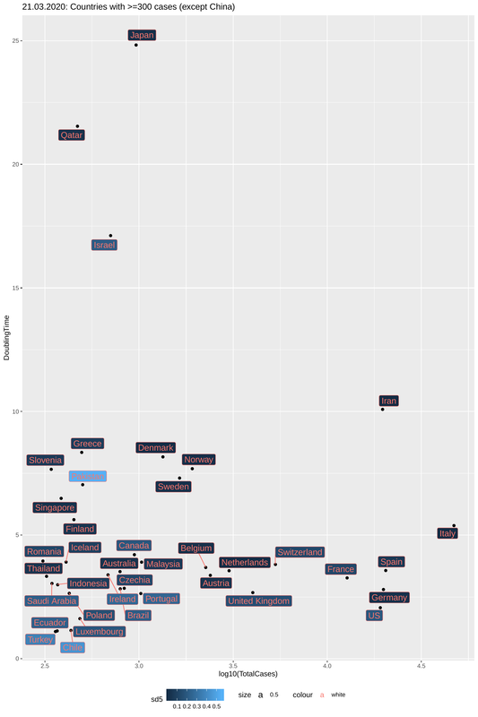
4. I then plotted the estimated Doubling Times against the total number of cases, taking into account the variability of increase rates. Each country is represented by a dot. Doubling time is on the y-axis and you want this to be as high as possible. This means you have efficiently "flattened the curve". Total cases is on the x-axis and this means, well the obvious, that a lot of people are sick (but caution: not all countries report in the same way). How reliable are the data? The darker the color of the label, the smaller the standard deviation of the increase rate, thus the more confident we can be of the doubling time we estimate.
A number of data scientists have been trying to make sense of the available data from many possible angles. Nevertheless, little more than the obvious (and expected) exponential increases have come out of most of the analyses. We now know that the virus is highly contagious and that exponential growth of cases should be the norm, but the goal is to tame this growth as much as possible and in this sense social distancing and case isolation are likely to be the only way to delay the peak of the epidemic (that is, the time when the number of sick people reaches the maximum), or (as you should know by now) to "flatten the curve".
One main problem with most data analytical approaches is the variability of reported data in terms of cases. While the number of deaths cannot be questioned, the way each country reports confirmed cases is very different. Some countries (like South Korea) have opted for extensive testing in the general population, while others (like for instance Greece) have explicitly targeted serious/critical cases, recommending that people with mild symptoms avoid over-crowding hospitals and diagnostic labs. I shall refrain from discussing arguments that exist both for and against these two extreme approaches and focus on the main problem that this variability poses in the analysis of the epidemic dynamics.
If some countries test a lot, the number of cases will be high but the case fatality rate (i.e. the number of deaths per active cases) will be smaller. Countries that test only people with severe symptoms will report low number of cases but higher fatality rates. In any case, it is difficult to tell how the spread differs from one country to the other.
How then can we really know what is going on?
One solution is to focus on increase rates instead of number of cases. Assuming that the way countries report cases doesn't change over time we can try to estimate the rate of increase in confirmed cases from one day to the other. Regardless whether one tests a lot or little, the number of new cases against the previous sum is representative of the spread. This is not something new and people have tried to figure out this rate from the slopes of log-linear fits, but the problem is that these slopes are very prone to random fluctuations especially when case numbers are small.
In the following I will present a simple approach to address the problem, and more importantly, to gauge into differences in the approaches that different countries employ to tackle the spread of the epidemic.
Data
I used data from Johns Hopkins University, Center for Systems Science and Engineering (CSSE), which are daily updated for all countries that have reported at least one confirmed case and which are freely accessible here: https://github.com/CSSEGISandData/COVID-19/tree/master/csse_covid_19_data.
Case Doubling Time
Instead of looking into slopes of increase curves, I tried to estimate Case Doubling Times. This is the time (in days) it takes for the number of cases to double, given the rate of increase over a certain period of time. This means that if we have N cases on day:x you can estimate the number of days it will take to reach 2N cases, assuming a constant increase rate r.
This is easily calculated from the following equation: Nr^(dt)=2N, where dt is the doubling time in days. Solving the equation for dt gives you: dt=1/log2(r), which means that a good estimate for r is equivalent to a reliable prediction of doubling (obvious).
What I did
1. I took the timeseries data (that is, cases per day for many days in a row) from the link above and estimated a rolling increase rate for every country that has reported at least 300 cases. Rolling, in this sense, means that starting from the day that each country reported the first case, I calculated the mean rate of increase between two consecutive days until today (March 21st).
2. As this gives a series of increase rates that is equal to the number of days of reporting (minus 1) it is, expectedly, very noisy, especially as the number of cases is still in the lows. You expect it to converge once sufficient cases have been reported (and then you hope it slowly drops to zero). This is why I used only the mean rolling rate of the last 5 days for each country. I then used this mean rate to estimate the Doubling Time explained above.
3. Even thus, the rate values may vary significantly in countries, where cases have been reported for a short period and this is why I combined the mean rate with its standard deviation (how much it varied over the last 5 days) and the days since the first case was reported.
4. I then plotted the estimated Doubling Times against the total number of cases, taking into account the variability of increase rates. Each country is represented by a dot. Doubling time is on the y-axis and you want this to be as high as possible. This means you have efficiently "flattened the curve". Total cases is on the x-axis and this means, well the obvious, that a lot of people are sick (but caution: not all countries report in the same way). How reliable are the data? The darker the color of the label, the smaller the standard deviation of the increase rate, thus the more confident we can be of the doubling time we estimate.
Conclusions?
So, what can we make of this figure?
Japan is the way to go
First of all, one should focus on the dark blue labels. These represent countries with low standard deviation of increase rates and thus reliable estimates of doubling times. That said, you want to be as high on the y-axis as possible. We knew already that Japan is doing a great job. Even though they were among the first countries to report a case, they have kept cases low (~1000) and -more importantly- with a doubling time of 25 days. This means that, provided things don't change, Japan is not expected to have more than 3000 cases by the end of April.
Good signs from Italy
Italy has, on the other hand, been described as the horror story so far. An exploding number of cases, coupled with a high fatality, both of which are probably due to strong exponential increase rates in the early days after the outbreak. Nevertheless, Italy's doubling time is now 5.4 days, almost double that of Germany (2.8 days) and more than double that of the US (a little over 2 days). Whether this is due to the heavy restrictions on movement and social distancing that were imposed a bit more than a week ago remains to be seen. Even though dt=5.4 is not perfect (if stable it means an 60-fold increase within the period of one month), Italy's doubling time was <3d, a few days ago and was less than 2 days in the early days of the epidemic, which means that significant progress is being made in stopping the spread. One possibility is that Italy has simply reached a saturation point in terms of testing capacity and can now only perform a certain number of test everyday, most of which come out positive. This may also be the case of Iran, one of the countries that suffered mostly but which now reports low number of cases and doubling time of more than 10 days. This will be made clearer in the days to come.
Central Europe should look towards Scandinavia
What about the rest? Bad news for the US, Germany, the UK and Austria, for all of which doubling times are estimated to be on the lows. The Netherlands, Belgium and Switzerland are doing a bit better. The Scandinavian countries are performing rather well and in spite great numbers of cases (taking their population into account) they seem to have slowed down the spread. Not much can be said for countries like Greece, Iceland or Slovenia where the spread looks to be halted but the number of cases is still low to allow for accurate estimates. Countries in the bottom left part of the plot have very low number of cases and great standard deviations for increase rates. It is just too early tell.
What more can we look into?
These are highly volatile data and so, one needs to keep looking for more as the timeseries become longer and thus rolling estimates of increase rates converge. It would be very interesting to look into how doubling times changed for each country taking into account the sort of counter-measures imposed, and, perhaps more importantly, how early after the first case they were put into place. This will probably give us a better idea on what the best approach is. Everybody agrees we are on uncharted waters and need to approach every analysis and its interpretation with a lot of caution.
 RSS Feed
