In a recent blog post about the Covid 19 epidemic I have tried to tackle the problem of variability in the reporting of SARS-CoV-2 confirmed cases by estimating the case doubling times for various countries. A few things of note from that analysis included:
a. Very different doubling times between countries that suggested that some have effectively managed to slow down the spread of the virus. China in that respect had already succeeded in almost putting the epidemic to a halt and so was not included in the analysis.
b. Even though the estimated doubling times were rather stable they showed an interesting dynamics which called for a more careful analysis. This is true for almost everything that has to do with this epidemic, which is the first of this scale to be monitored in real time.
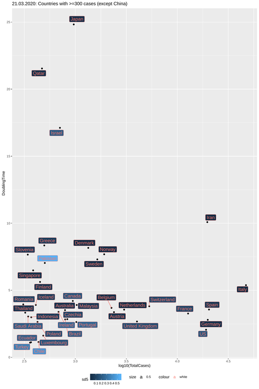
c. There was no correlation between number of cases and doubling times (Italy being the most problematic case with high number of infected people and low doubling time). There was also no correlation between the doubling times and the days since the first case was reported in each country. This means that even in countries that the "spill" occurred more or less at the same time, the situation has not been developing in the same way.
All of the above imply that a more careful examination and the factoring in of other aspects is required. In this post I have tried to dissect the different modes of the developing situation in countries with more than 300 cases (as of March 24th) excluding China and South Korea that appear to have contained the situation (and hopefully will remain thus).
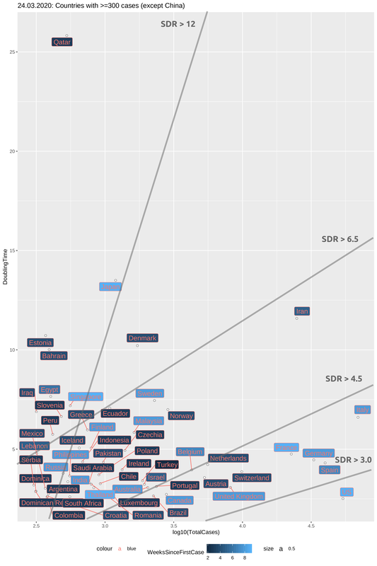
In the plot below I have created the same graph as in the previous post with an update on the data four days after. A number of things regarding the dynamics can be seen by comparing this plot to this one for March 21st. Italy is showing signs of slowing down the spread moving up the y-axis (Doubling Time, DT). France and Germany have done this quicker but Spain has not done much (with a constant DT of <4). The US is the most worrying case (as many have already noted). With a big population and a doubling time of < 3 it is a question of days before they become the center of the outbreak.
One main difference of this plot with the previous one is the colouring of the counties, which now represents the time since the first reported case (in weeks). All countries with more than 10k cases belong to the category of "early outbreaks" and are thus coloured light blue. But not all "early outbreak" countries have many cases and this is largely due to their high doubling times (Japan and Singapore the prime examples). In the plot below, I have tried to group countries based on the combination of doubling times and weeks since first case, by drawing regression lines that represent a (sort of) Slow-Down Rate (SDR). The higher the slope the most effective the slowing down of the spread is. You may think of the SDR as the fight to increase the doubling time while dealing with an increasing number of cases. For most epidemics the natural cause of things is that doubling times increase (and the spread slows down) with the accumulation of cases, but unfortunately this only happens after a large percentage of the population has been infected. As we try to flatten the curve we cannot afford this and so we hope that this slowing-down will happen with case isolation through quarantine. It remains to be seen if points on this plot show a trend of moving fastly towards the bottom right (bad scenario) or slowly towards the top right (good scenario).
Through four SDR regression lines, I have split the plot in four areas, each of which contains at least one country where the outbreak was detected early. this means that different SDRs cannot be attributed to insufficient time for observations. In this way, we can then correlate the development of the situation in each country-group with other characteristics and one such is the mitigation measures that have been imposed, as we will see right after.
Looking into the plot below (and note that this is a rough, eye-balling split) we can see four different groups. From best to worst, Japan and Singapore have SDR > 12 as do Quatar, Slovenia and other countries which are -nonetheless- late in reporting a case. Their goal is to stay in that area of the plot. A large group with SDR between 6.5 and 4.5 includes the Scandinavian countries (except Denmark which was late in reporting a case and is doing rather well) and a number of other "late outbreak" countries. Some struggle to stay in this area (Belgium, Israel, the Netherlands and Australia) while others (like Greece and Iceland) may be more optimistic. Unfortunately the countries that represent more than 90% of the active cases worldwide lie in SDR areas that are below 4.5. Italy is fighting to get into the "OK" zone of SDR=4.5-6.5 but Germany, France and Spain (in particular) are far from that. The US is even further down. The spread shows no sign of slowing down. Quite the opposite.
a. Very different doubling times between countries that suggested that some have effectively managed to slow down the spread of the virus. China in that respect had already succeeded in almost putting the epidemic to a halt and so was not included in the analysis.
b. Even though the estimated doubling times were rather stable they showed an interesting dynamics which called for a more careful analysis. This is true for almost everything that has to do with this epidemic, which is the first of this scale to be monitored in real time.
c. There was no correlation between number of cases and doubling times (Italy being the most problematic case with high number of infected people and low doubling time). There was also no correlation between the doubling times and the days since the first case was reported in each country. This means that even in countries that the "spill" occurred more or less at the same time, the situation has not been developing in the same way.
All of the above imply that a more careful examination and the factoring in of other aspects is required. In this post I have tried to dissect the different modes of the developing situation in countries with more than 300 cases (as of March 24th) excluding China and South Korea that appear to have contained the situation (and hopefully will remain thus).
In the plot below I have created the same graph as in the previous post with an update on the data four days after. A number of things regarding the dynamics can be seen by comparing this plot to this one for March 21st. Italy is showing signs of slowing down the spread moving up the y-axis (Doubling Time, DT). France and Germany have done this quicker but Spain has not done much (with a constant DT of <4). The US is the most worrying case (as many have already noted). With a big population and a doubling time of < 3 it is a question of days before they become the center of the outbreak.
One main difference of this plot with the previous one is the colouring of the counties, which now represents the time since the first reported case (in weeks). All countries with more than 10k cases belong to the category of "early outbreaks" and are thus coloured light blue. But not all "early outbreak" countries have many cases and this is largely due to their high doubling times (Japan and Singapore the prime examples). In the plot below, I have tried to group countries based on the combination of doubling times and weeks since first case, by drawing regression lines that represent a (sort of) Slow-Down Rate (SDR). The higher the slope the most effective the slowing down of the spread is. You may think of the SDR as the fight to increase the doubling time while dealing with an increasing number of cases. For most epidemics the natural cause of things is that doubling times increase (and the spread slows down) with the accumulation of cases, but unfortunately this only happens after a large percentage of the population has been infected. As we try to flatten the curve we cannot afford this and so we hope that this slowing-down will happen with case isolation through quarantine. It remains to be seen if points on this plot show a trend of moving fastly towards the bottom right (bad scenario) or slowly towards the top right (good scenario).
Through four SDR regression lines, I have split the plot in four areas, each of which contains at least one country where the outbreak was detected early. this means that different SDRs cannot be attributed to insufficient time for observations. In this way, we can then correlate the development of the situation in each country-group with other characteristics and one such is the mitigation measures that have been imposed, as we will see right after.
Looking into the plot below (and note that this is a rough, eye-balling split) we can see four different groups. From best to worst, Japan and Singapore have SDR > 12 as do Quatar, Slovenia and other countries which are -nonetheless- late in reporting a case. Their goal is to stay in that area of the plot. A large group with SDR between 6.5 and 4.5 includes the Scandinavian countries (except Denmark which was late in reporting a case and is doing rather well) and a number of other "late outbreak" countries. Some struggle to stay in this area (Belgium, Israel, the Netherlands and Australia) while others (like Greece and Iceland) may be more optimistic. Unfortunately the countries that represent more than 90% of the active cases worldwide lie in SDR areas that are below 4.5. Italy is fighting to get into the "OK" zone of SDR=4.5-6.5 but Germany, France and Spain (in particular) are far from that. The US is even further down. The spread shows no sign of slowing down. Quite the opposite.
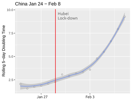
The question then is: What is making Japan and Singapore so successful and what will help Belgium and the Netherlands avoid the fate of Italy? One answer that has been suggested by the short-term history of this developing situation is: extreme self-isolation measures with effective lock-downs. And this is in fact the approach that most of the countries have been adopting. The best example for Its efficiency as a means of slowing down the spread (even to a halt) has come from China that has now effectively contained the virus. Below we see the steady increase of doubling time in China from January 24th (the first date for which we have data) to February 8th. There is a marked increase in doubling time that more or less starts before the decision for a full lock-down in Hubei province (the epicenter of the outbreak). While the slowing down was already under way before the measures were put into place there is a notable increase of the curve, from February 3rd, which comes a week after the lock down.
To say we have learned from China is easy but to actually do it like them is more complicated. A number of special characteristics made it much easier to impose and maintain the lock-down in Hubei. The lock down did not affect the whole country and the relationship between the state and the people (to put it gently) made things easier.
To say we have learned from China is easy but to actually do it like them is more complicated. A number of special characteristics made it much easier to impose and maintain the lock-down in Hubei. The lock down did not affect the whole country and the relationship between the state and the people (to put it gently) made things easier.
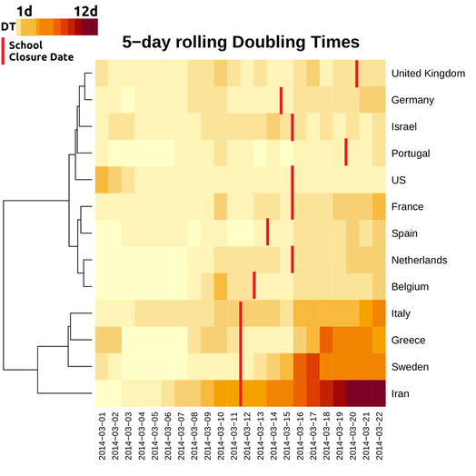
What about the rest of the world then? It was not very easy to collect data for when exactly measures were taken in every country. There is variability in this respect too, as some countries have not gone into full lock down or did so only after milder measures were put into place. To keep things as homogeneous as possible, I obtained the dates when school closure was decided in 13 countries, from wikipedia articles on the Covid 19 epidemic. I then went back to the Confirmed case data and calculated 5-day rolling doubling times for the last three weeks. This means that, starting from March 1st, I calculated average doubling time estimates for five consecutive days. (Note: this was done to get smoother estimates. It was also the approach I used for the data from China in the plot above).
The results are shown below for 11 European countries (including my native Greece), the US and Israel. I hope to have time to include more in the future, (provided I find time to read wikipedia articles, or get a reliable comprehensive data source). The heatmap shows doubling times from March 1st to March 22nd (because of the 5-day averaging, the two final dates refer to a central date -2). Doubling times lie in a range of 1 to 12 with Iran being in the best situation. You basically look the plot from left to right and hope to be moving steadily (and as fast as possible) to darker colours.
What does it tell us?
1. First of all, things are encouraging for Italy. Its dynamics in increasing doubling time puts her in the same cluster with Sweden, Greece and the obvious outperformer of the plot that is Iran.
2. A second cluster containing France, Belgium, the Netherlands and Spain is seriously lagging behind but things are positive for France and the Netherlands that show a slowing down (darker colours as we move from left to right). Still too early to tell about Spain and Belgium.
3. The last cluster is quite inhomogeneous. Germany looks more like France than the UK or Portugal but it is probably the large number of cases that obscures its performance. The US are an obvious outlier. Things don't seem to be going anywhere better.
But remember we did all this to see if the measures on social isolation can actually work. Can we reproduce the effect they had on China? The answer is yes, but not entirely. There appears to be a mild positive association with how early the measures were taken and the development of the situation. Greece, Sweden, Iran and Italy all closed their schools on March 11th. This didn't happen in the UK before March 19th, more than a week after. On the other hand, the lag in school closure between Spain and Italy appears small to justify the dynamics of doubling times between them. Italy is getting better, Spain is not. But it could well be that two or even one day can really make a difference.
There are also a number of factors that we cannot easily account for. The red lines below show the date schools were shut down but that is not the only measure. Most countries have gone into a complete lock down, shutting down bars and restaurants and even imposing curfews. The time when this happened was not the same. In others, like the US, even the time schools closed was not the same across the country. As data accumulate and the situation develops we will be in a better position to discuss the efficiency of the lock-down and (perhaps more importantly) the time it would be OK to lift them.
Other kinds of data need to be factored in as well. Population densities and demographics may make lock downs more or less effective and some countries may need to considered additional (or other) means of mitigation. It sounds frustratingly repetitive but we can only wait and see.
 RSS Feed
